Duncan Grant, illustration for ‘Europa and the Bull’ poem by W Rodgers, ‘The Arts’ journal, 1946.
This week in the Gift, we look at a series of objects that reveal a more commercial side to Duncan Grant’s work. In 1946 a commission by ‘The Arts’ a modern art journal, under the editorial supervision of Herbert Read, Edward Sackville-West, and Desmond Shawe-Taylor, provided a public platform for a new artistic collaboration. Grant’s contribution to the magazine was a painting and illustrated poem of ‘Europa and the Bull’ by W. R. Rodgers.

‘The Arts’ Issues One and Two, Lund Humphries & Co Ltd; London.
‘The Arts’ was interdisciplinary in nature, covering a range of artistic forms and practices within each issue. The first two issues feature in detail painting, sculpture, architecture, theatre, film, music, poetry and philosophy. The journals were designed to be aesthetically stimulating, presenting cover work and illustrative interpretations of poems and prose by contemporary artists alongside high quality colour lithograph plate representations of more prominent works.
The utilization of a variety of paper and print techniques emphasize the depth and detail in the featured images; the subsequent quality of the images were evidently realized by the editorial board. Content was also held in high regard as the journal features many esteemed writers such as Clive Bell (this was most likely the connection that secured Grant his commission), Edward Sackville-West, Robert Medley, Sir Kenneth Clark, Benedict Nicolson and Raymond Mortimer amongst others. At ten shillings a book the high quality was quite matched by the price, and readership would have most probably been limited to the educated middle classes. With only two issues published, Issue One in 1946 and Two in 1947, information regarding the journal is unfortunately limited.

CHA/P/2705 Recto. Duncan Grant, design for ‘Europa and the Bull’ poem by W Rodgers, pen on paper. Photograph © The Charleston Trust
Duncan Grant’s works in the gift includes studies for the illustrated poem as well as the final piece used. Gaining inspiration from ‘Europa and the Bull’, Grant’s form emulates classical mythology as well as the natural world. The cross-hatching of black penned lines against the text blurs the poem into the piece, mirroring the imperfect lines of language. Impressionistic in line, the inscribed pen strokes add texture and tone to the image.

‘The Arts’ Issue One, Lund Humphries & Co Ltd; London.
The opening page of the poem and thus Grants illustrated segment (this original was not found in the AG gift), is strikingly juxtaposed with a large photograph. An abstracted female form seated pronounces a smooth modernist sculpture by Henry Moore, which sits opposite the contrasting classical design. A black pen illustration envelopes the poems text, showing seated female nudes frolicking in the textured grass. This work somewhat mirrors the panels Grant produced for the Cunnard Commission, a design for interior decorative panels to be exhibited on RMS Queen Mary (although these were later rejected).
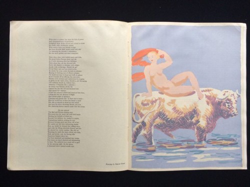
‘The Arts’ Issue One, Lund Humphries & Co Ltd; London.
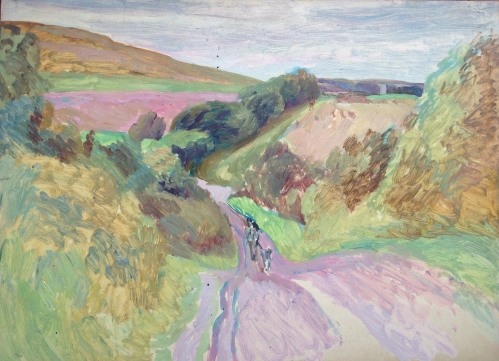
The feature comes to a close with a lucid and bright painting by Grant. A matte paper displays the colours in block form and in an array of fresh pastels we are finally introduced to Europa. She lays nude on the back of the Bull, one arm above her head gesturing playfully with a red scarf, the bull moves steadily through the water, expressive of a unity between them.
Two images within the gift show studies for this final print, evidencing differing concepts for the composition of the piece. Grants inspiration from the myth of Europa is clear; where Zeus captures her in the form of white bull and their sexual relationship legitimises Europa’s powerful son, King Minos of Crete.
CHA/P/2626 & CHA/P/2627 Recto. Duncan Grant, designs for ‘Europa and the Bull’ poem by W Rodgers, pencil on paper. Photograph © The Charleston Trust
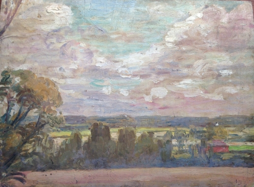
The piece below is a design that did not make the final print, though it could have been inspiration for the final image used as the same colour palette is evident.
CHA/P/2704 Recto & Verso. Duncan Grant, design for ‘Europa and the Bull’ poem by W Rodgers, inscription “Design for ‘Europa and the Bull’ poem by W Rogers, (sic) c1945”, pencil and gouache on paper. Photograph © The Charleston Trust
This set of images were not Grants only work produced for the journal; also linked is a study for a front cover of ‘the Arts’ in his usual bold style full of form and movement. Figures appear to be dancing across the pages, acrobatics with circular instruments create motifs repeated throughout the piece displayed in the curves of the male physique and reflected in the text form. We do not know if this was an early study for one of the initial two journals or a suggestion for the next, nevertheless production for ‘the Arts’ was unfortunately discontinued in 1948.

CHA/P/1803 Recto. Duncan Grant, cover design of ‘The Arts’ journal, never produced, watercolour on paper. Photograph © The Charleston Trust