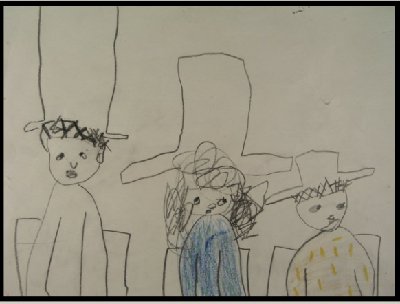
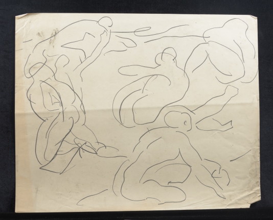
This week’s discovery of a child’s drawing in the Gift can be seen to reveal more about the children of Bloomsbury and their involvement in the creative practises of the household.

CHA/P/2806. Recto, Child‘s drawing of female figure wearing a dress and hat, found in the Gift, artist unknown. Photograph © The Charleston Trust.
For the generations of children growing up at Charleston, creativity had no bounds. Virginia Nicholson (née Bell), who spent every summer there with her parents, grandparents and Duncan Grant recalls:
‘My brother and sister [Julian and Cressida] and I grew up, as did [my father] Quentin and his siblings, with the conviction that Art was something everyone could do. Paint, clay, mud, glue and matches, were all endlessly available. Yet did the inhabitants of Charleston ever really grow up? Charleston ever really grow up? There is a wonderfully uninhibited, irreverent quality to the decoration of the house which is that of a child let loose to experiment and which is extraordinary liberating.’[1] (Bell and Nicholson, 1997, p.6)
Pinned to the Studio mantelpiece are drawings by the five-year old Virginia that plainly shows her family’s encouragement of her creative imagination. In one, three figures, painstakingly drawn, with extraordinarily audible expressions, are seated in identical chairs, wearing enormous hats of varying proportions! In another, titled ‘GOING HUNTING’ (labelled in large bold letters at the bottom of the rural landscape suggestive of Charleston’s surrounding countryside), a knight in chainmail sits astride a horse, it’s front legs accurately drawn raised in a galloping motion.
CHA/E/149. Recto, Child‘s drawing, circa 1960, by Virginia Bell, pencil on paper. Photograph © The Charleston Trust.

CHA/E/150. Recto, Child‘s drawing , circa 1960, by Virginia Bell, pencil on paper. Photograph © The Charleston Trust.
At Charleston, Virginia and her brother, sister and cousins had plenty to stimulate them, with the eclectic range of sights, smells and sounds of Charleston to take in. Virginia recalls her:
‘…memories of adventures around the pond, of being painted by Vanessa and Duncan in the studio, of the lovely smell of new cake, books and turpentine that pervaded the house, of crocks of wet clay in the pottery, of dahlias in the garden and sweet lavender drying in the spare rooms.’ (Nicholson, 1997, p.6)
During those first early years at Charleston, its inhabitants found it a challenging and inhospitable place to live; not largely because of the shortage of food and greater isolation out in the country as a result of the War. For Vanessa Bell, who manned the household, the most challenging aspect of this life was juggling practical responsibilities with her painting. To Roger Fry, a close confidant, in April 1917 she wrote: ‘You don’t know how desperate I sometimes get about everything, painting, bringing up the children properly etc.’ In response to this, Fry sent her back a positive reply in his letter, praising her for her, ‘…marvellous practical power [which] has of course really a quality of great imagination in it, because your efficiency comes without fuss. No I don’t think you need ever doubt yourself. You have genius in your life as well as in your art and both are rare things.’
Roger Fry took an interest in Vanessa Bell’s children and how they were brought up. His comment of their mother’s ‘great imagination’, made to her in reassurance of her anxieties expressed to him that she could not both paint and bring up her children well at Charleston, are revealing of his beliefs about the educational philosophy of children in relation to creativity. In 1917, Fry wrote an article for the Burlington Magazine; ‘Children’s Drawings’, highlighting his main belief that, ‘…teaching [of art, to children] destroy[s] completely the[ir] peculiar gifts of representation and design, replacing them with feeble imitations of some contemporary convention.’
Since their move to Charleston in 1916, Vanessa Bell had been worrying about her children’s formal education: should she send Julian and Quentin away to school when they were still young, or would the traditional public school system be constraining to their development? She concluded that she would set up a small school at Charleston and they were initially taught there by a governess. Their mother taught them French and Music, though, interestingly, there is no record of her ever teaching them her own trade. Angelica Garnett also remembered this absence of art lessons at home: in Gordon Square, she was given ‘one painting lesson…[by] Vanessa…the only one [she] ever gave me,’ Perhaps then Bell did share Fry’s view that ‘art cannot…be taught at all [as]…art is a purely subjective affair…everyone is an artist…[and]…children [should be] stimulated to create instead of being inhibited by instruction [as] no modern adult can retain the freshness of vision, the surprise and shock, the intimacy and sharpness of notion…’ like that of a child can.

CHA/P/2281. Recto, Child’s drawing, sketches of fairies, ’37 Gordon Square’, by Angelica Bell, ink on letter writing paper. Photograph © The Charleston Trust.
Judging by the liberal way in which her children were allowed to explore and play, there is no doubt that Bell gave them free rein to be as creative as they wished. ‘After all,’ Virginia Nicholson wrote ‘Charleston was a place where, for both children and adults, messy creativity was a way of life.’

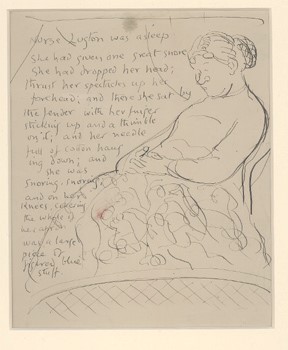
CHA/P/2263. Recto, Child‘s drawing of male portrait figure wearing yellow military style jacket with medals and sash, titled, ‘his majesty of crimtartary’, artist unknown, found in the Gift. Photograph © The Charleston Trust.
Whilst creative practises were all-encompassing at Charleston, Vanessa Bell and Duncan Grant took their individual work as artists extremely seriously. In 1925, a tailor-made studio was constructed for them at Charleston which suited all of their requirements as painters: it needed to have a good natural light, be quiet and therefore removed from the house and garden. The result was, as Vanessa described it shortly afterwards: ‘…the perfect place to work.’
Of the Studio at Charleston, Angelica Garnett wrote; ‘It was the sanctuary in which I spent the most treasured hours of my life…I was both protected and stimulated, without a shadow of responsibility…sitting on the studio floor engrossed in some manual occupation while those patient elders concentrated in their own dreamlike fashion on their art.’
Bell and Grant’s studio, Angelica saw as ‘the citadel of the house’, and as the child of artists, she grew up with a sense of the reverence and devotion her parents gave to the practise of painting, observing them close at hand. Her touchingly innocent observations of what she saw here of the artistic ‘hard work and concentration’, preciously taken to create ‘the most important things’ are vividly described in curious detail, reflective of that of a painters’ eye:
‘Easels and paint boxes stood about, brushes, sometimes festooned with cobweb, emerged from jugs or jam jars, palettes and tubes of paint lay on stools and tables, while there was often a bunch of red-hot pokers and dahlias arranged in front of a piece of drapery. The gun-powder-coloured walls were hung with canvases of many shapes and sizes, and some of Duncan’s favourite objects, such as jointed- or rather disjointed- Sicilian wooden horse, a silver table-watch…a fan and perhaps a child’s drawing, could be seen balanced on the mantelpiece or pinned to a spare piece of wall.’ [2] (Garnett, 1984, p.93)
For Roger Fry, ‘This habit of attributing strong emotional values to all the objects surrounding them is what makes the visual life of children so much more vivid and intense than the visual life of almost all grown-up people.’ When Angelica was allowed in the Studio with Bell and Grant, she was under strict instructions not to disturb them whilst they were at work, and there was an unspoken expectation that ‘I should behave like a grown-up.’ However ; ‘I absorbed much of the atmosphere that I afterwards valued.’. Angelica Garnett later went on to be an artist in her own right, attributing these early experiences to her development.
Angelica’s tenacious relationship with her parents as well as their own, intimate relationship (then unbeknown to her), did cause her to struggle with a ‘consuming desire to identify with them.’ The time she spent with them in the studio was therefore treasured. Years after she put pen to paper and wrote about her childhood memories in an attempt to understand her relationship with them better, she looked back on this exercise and asked: ‘What picture had I drawn [of them] and how true was it?’ It is evident that, as an artist, she had looked at things in the same way as her parents had.

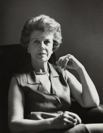
Angelica Vanessa Garnett (née Bell), in her parents’ studio at Charleston, 1979, by Jane Brown. Photograph © National Portrait Gallery.
Was it largely because they were Bloomsbury artists? In her book Deceived With Kindness (1984), Garnett talks about her parents’ ‘detachment’ from their true emotions, citing their ‘lack of physical warmth’ towards her when she was a child as due to the fact that they had kept the truth of her parentage from her. As ‘Bloomsbury, [they] believed and largely practised intellectual tolerance, but often failed to recognize the power of the emotions or the reasoning of the heart.’ Vanessa Bell, mother and artist, had ‘invented the vibrant colours and shapes that [had] surrounded [her children]’, encouraging their free play and creativity, but complex innermost feelings caused her to retreat, and always to her sanctuary, the studio.

Vanessa Bell painting in her studio at Charleston, 1936. Photograph © Tate Archives
The child’s presence in Bell and Grant’s studio has been evident since Angelica Garnett was small. Drawings that their children had made were pinned to the mantelpiece, and that of their grandchildren’s, some thirty years later. Whilst this childish work (below) is not revealing of any emerging Bloomsbury style of aesthetic, it is a sweet reminder of the sharp inquisitiveness of the Charleston children, busy at work with crayons on tables and floors; creatively inspired, and of how they were always encouraged by their elders.

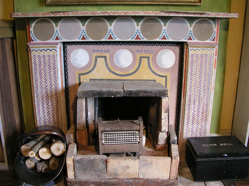
The Studio at Charleston. Photograph © The Charleston Trust.
[1] Bell, Q. and Nicholson, B. (1997) Charleston: a Bloomsbury house and garden: Frances Lincoln Limited, London.
[2] Garnett, A. (1995) Deceived With Kindness: A Bloomsbury Childhood. Pimlico, London.

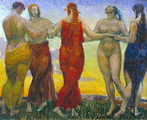
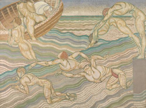 Duncan Grant, Bathing, 1911. Oil paint on canvas. Photograph © Tate.
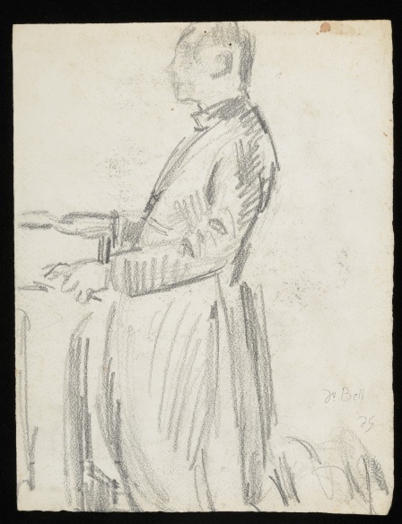


![GraceHiggenscTonyTree[1].jpg](https://thecharlestonattic.files.wordpress.com/2016/06/gracehiggensctonytree11.jpg?w=500)

![0 T UMAX PowerLook III V1.5 [2]](https://thecharlestonattic.files.wordpress.com/2016/05/cha-p-174avb.jpg?w=500&h=395)