The Charleston Attic

Category: Literature

Book illustrations and jacket designs by Duncan Grant

As Charleston looks forward to a weekend of Centenary celebrations, ‘The Attic’ is being specially prepared to open its doors for visitors this Sunday 16 October. Rarely on show to the public, the space, accessed by narrow, steep stairs at the top of the farmhouse was once Vanessa Bells’ studio and now stores Charleston’s extensive archive collection and works of art.  

My first blog post as Charleston’s ‘Attic intern’ showcases some of Duncan Grant’s book illustrations and book jacket designs from the 1960s. Newly catalogued from the Angelica Garnett Gift is a collection of Duncan Grant’s correspondence regarding his illustrations for a previously undiscovered short story by Virginia Woolf featuring ‘Nurse Lugton’ and a book jacket design for a novel by Margaret Lane called A smell of burning.  

Nurse Lugton’s Curtain.

A letter dated 18 May 1865 written to Duncan Grant by John Willett of The Times Literary Supplement [TLS] discussed available space in the supplement for the ‘story and illustrations’:  

cha-e-253-r-c

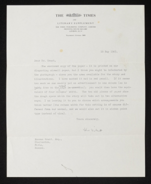
CHA/E/253, ‘Letter to Duncan Grant from John Willett deputy editor of The Times Literary Supplement’, 18 May 1965. © The Estate of Duncan Grant. Photograph © The Charleston Trust.

Further research has revealed that ‘the story’ referred to in the letter was a children’s tale written by Virginia Woolf featuring a character named ‘Nurse Lugton’. It had been newly discovered in 1965 by children’s fiction author, Wallace Hildick (1925-2001). According to an article written by Hildick published in TLS of the 17 June 1965, this story had been found in the second volume of the Mrs Dalloway manuscript acquired by the British Museum in 1963. Hildick edited the story and it was framed with illustrations drawn by Duncan Grant and published alongside the newspaper article. [1]


woolf-tls

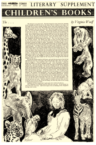
‘Children’s Books, The ….. by Virginia Woolf’, The Times Literary Supplement, Thursday, June 17, 1965; pg. 496; Issue 3303. © News International Associated Services Limited Gale Document Number: EX1200337421.

Also in the archives from the Angelica Garnett Gift are two manila envelopes which refer to Virginia Woolf’s story; item CHA/E/252 once contained an illustration and item CHA/E/251 is inscribed by Duncan Grant with a handwritten list of illustrations, such as ‘1. Nurse Lugton asleep’ which probably refers to the illustration of Nurse Lugton in the Times article.  

cha-e-252-v-c

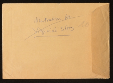
CHA/E/252, verso, manila envelope, © The Estate of Duncan Grant: Photograph © The Charleston Trust.

cha-e-251-v-c

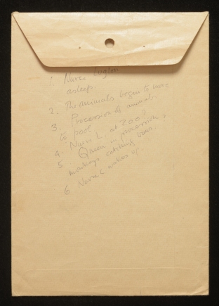
CHA/E/251, verso, manila envelope with inscription, © The Estate of Duncan Grant: Photograph © The Charleston Trust.

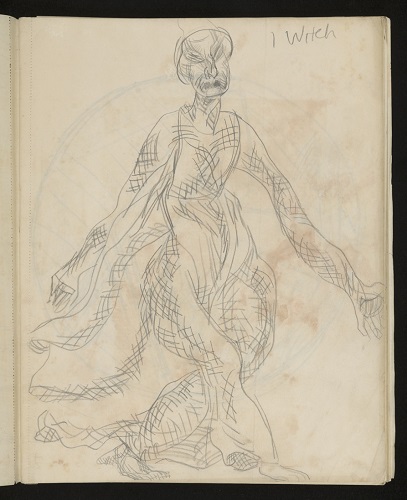
The Virginia Woolf Collection at the E.J. Pratt Library at the Victoria University in the University of Toronto holds a Duncan Grant drawing entitled Nurse Lugton was asleep with handwritten notes by Duncan Grant of the opening passage of the story, first published in 1965 in a collection as Nurse Lugton’s Curtain. In this version of the drawing Nurse Lugton looks somewhat different to her Times Literary Supplement counterpart.

nurse-lugton

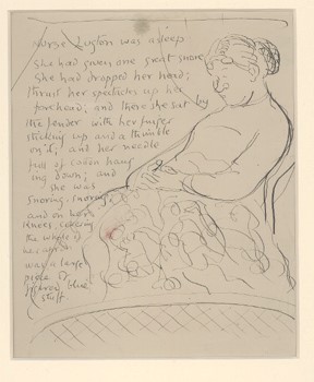
Duncan Grant (1885-1978), Nurse Lugton was asleep, study for a page of Nurse Lugton’s Curtain by Virginia Woolf PR6045.O72 N8 1991 VUWO. Photograph: Victoria University in the University of Toronto.

A smell of burning

A letter from Roger Machell of Hamish Hamilton to Duncan Grant dated 10 August 1965 refers to Grants interest in designing a jacket for a novel by Margaret Lane (1907-1994) called A smell of burning.

a-smell-of-burning

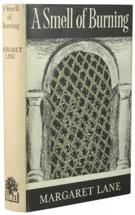
Margaret Lane, A smell of burning, 1965, Hardcover, 1st Edition. Published 1965 by Hamish Hamilton. Image: Goodreads.com. Cover design by Duncan Grant.

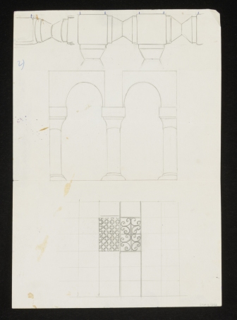
The letter contains two sketches, one by Margaret Lane’s husband, Lord Huntingdon and the other by Margaret Lane herself ‘showing the kind of window that might make a suitable basis for a design’.[2]

cha-p-3121-r-c

CHA/P/ 3122, Lord Huntingdon, Drawing (1), ideas for jacket design for A smell of burning, 1965. © The Estate of Duncan Grant. Photograph © The Charleston Trust.

cha-p-3122-r-c

CHA/P/ 3121, Margaret Lane, Drawing (2), ideas for jacket design for A smell of burning, 1965. © The Estate of Duncan Grant. Photograph © The Charleston Trust.

Author and critic Margaret Lane was the former wife of Brian Wallace, son of writer, Edgar Wallace. She was the second wife of Lord Huntington whom she married in 1944. The couple lived at Black Bridge House in Beaulieu where her artistic talents were expressed  ‘Bloomsbury’ style: according to Elizabeth Jenkins writing Margaret’s obituary for the Independent,  her ‘creative faculty found expression in decorating surfaces [….] and in her later life the hobby of covering screens, pasted with a collage of scraps, wonderfully collected, each of them a work of art’.[3]

margaret-lane

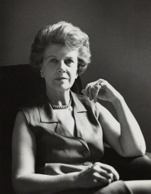
Godfrey Argent, Margaret Lane (Lady Huntingdon), bromide print, 28 July 1969, Photographs Collection National Portrait Gallery x165942. © National Portrait Gallery, London.

[1] Wallace Hildick, ‘Virginia Woolf for Children?’, The Times Literary Supplement (London, England), Thursday, June 17, 1965; pg. 496; Issue 3303.

 [2] CHA/E/255, ‘designing a jacket for A smell of burning’, Letter from Roger Machell (editorial director) of Hamish Hamilton (publishers) to Duncan Grant, 10 August 1965, The Charleston Trust Archives. 

[3] Elizabeth Jenkins, ‘Obituary Margaret Lane’, Independent, Thursday 17 February 1994, http://www.independent.co.uk/news/people/obituary-margaret-lane-1394635.html


A Bloomsbury Centenarian: On Anne Olivier Bell’s 100th Birthday

This week, Charleston celebrates a very special birthday – the 100th birthday of Anne Olivier Bell (née Popham) – Charleston’s President, and a prominent editor . In her 98th year, Mrs Bell received an MBE in honour of her longstanding services to art and literature, and looking back at her remarkable career, it is not difficult to see why.

13495117_1521270931304962_3460946581219286778_n[1].jpg

Anne Olivier Bell, pictured on her centenary birthday party at her Sussex home; Sunday 19th June 2016. Photograph, © The Charleston Trust 


Anne Olivier Popham trained as an art historian at the Courtauld Institute in the 1930s. The family had an artistic background; her father, Arthur Ewart Popham, was Keeper of the Department of Prints and Drawings at the British Museum. .

During the second world war, all women were expected to do work of national importance, and Anne Popham was no exception. She was employed by the Ministry of Information as a research assistant in the Photographs and Public Divisions. . In 1945, after the war had ended, she was recruited to join the so-called ‘Monuments Men’, a group of men and women from thirteen different nations who formed the Monuments, Fine Arts and Archives branch of the German Control Commission:

‘Many were museum directors, curators, art historians, architects and educators. Together they worked together to protect monuments and other cultural treasures from the destruction of World War II. In the last year of the War, they tracked, located, and in the years that followed returned more than five million artistic and cultural items stolen by Hitler and the Nazis. Their role in preserving cultural treasures was without precedent.’

[Robert Edsel, Founder and Chairman of the Board for the Monuments Men Foundation for the Preservation of Art]

In November that year, Miss Popham was posted to the MFAA Branch of the Control Commission based in Bünde, Westphalia in the British zone, where she co-ordinated the Branch Officers’ work. Her diaries from this two-year period, now preserved in the Imperial War Museum, chart the purposeful pace in which she and her colleagues carried out this stressful work.. As she recalls: ‘There was always a great deal of tension between the needs of the Military and the requirements of the Monuments Officers, especially in the invasion of France…’

In 1947 Popham returned to London, where she worked in the Exhibitions Department of the Arts Council of Great Britain (formed after the Second World War by John Maynard Keynes, who was appointed the first official Chair). Here, her proven flair for scholarship proved useful in her editing of exhibition catalogues.

It was not long afterwards that Olivier met Quentin, the son of the renowned art critic Clive Bell, , and Vanessa Bell, one half of the Bloomsbury painterly duo, who invited her to Charleston to sit for a portrait.

Quentin Bell was a painter and ceramicist who would later become Professor of Art History at Leeds University, and Professor of History and Theory of Art at Sussex University. In the 1960s Anne Olivier Bell worked with her husband on the first authorised biography of Virginia Woolf, published in 1972. This was followed by the publication of Woolf’s five-volume 1915-19 diaries, which she edited over the years between 1977 – 1984. These diaries, in their published form, have become a primary resource for the study and appreciation of Woolf and Bloomsbury.In recognition of this work Olivier Bell has received honorary doctorates from Sussex and York universities.


++vw diary poster.jpg

CHA/E/41 Recto. Poster, a 1978 poster of Virginia Woolf advertising the publication of Volume 2 of her letters by the Hogarth Press, edited by Anne Oliver Bell. Photograph © The Charleston Trust


Anne Popham’s only encounter with Virginia Woolf was fleeting; she recalls noticing ‘this beautiful lady in a red silk dress’ at a Bloomsbury party. Vanessa Bell’s painting, ‘The Garden Room at Charleston’, captures perfectly the atmosphere of Anne Olivier Popham’s early visits to Charleston. The French windows are open to the garden, bright and lush, and one can sense the warmth of the afternoon. Miss Popham is the figure depicted sitting in a chair, turned towards the garden. In picturing this summery scene, it is easy to imagine the draw of the idyllic countryside to a London girl. Although she remembers feeling slightly daunted by the witty intellectuals with their interesting talk, she formed a good relationship with the artists Vanessa Bell and Duncan Grant. Quentin Bell was also charmed by her, and asked her if he could model her head in clay. They were married in 1952.


CHA-P-1567-R_C.jpg

CHA/P/1567 Recto. Vanessa Bell, The Garden Room at Charleston, painting. Photograph © The Charleston Trust


+head of olivier bell.jpg

CHA/SC/22 Recto. Quentin Bell, Bust, ‘Head of Olivier Bell’, terracotta. Photograph © The Charleston Trust


In 1953, Vanessa Bell painted Anne Olivier Bell’s portrait again. The new Mrs Bell holds herself upright, her gaze directed thoughtfully into the distance. She is smartly dressed and looks dignified, and the same can be said about the recent photograph of her, taken 63 years later in the garden of her Sussex home at her centenary birthday party. Some things are timeless.

+olivier bell, vanessa bell.jpg

CHA/P/1567 Recto. Vanessa Bell, Portrait of Olivier Bell, ‘Olivier Bell’, circa 1953, painting. Photograph © The Charleston Trust


At Charleston, ‘The kitchen was always warm and smelt of fresh coffee.’

For those who are regular readers of the The Charleston Attic blog, and have been following our progress as the newest Attic Interns through our work with the Angelica Garnett Gift, it may be of interest to hear that we have been spending some time away from the collection and from the attic in favour of the annual Charleston Festival.

Our festival roles took us downstairs through the house and into the kitchen. In keeping with the annual Festival tradition of curatorial services-turned-catering, we became fully immersed in our duties as ‘Green Room Hosts’; preparing for, receiving and generally looking after our guests with gusto. Perhaps we could have been seen as following in the footsteps of Grace Higgens (albeit for a very brief period), who worked tirelessly for over fifty years in the kitchen at Charleston.


Kitchen 2 Axel Hesslenberg.jpg

Axel Hesslenberg, The kitchen at Charleston. Photograph, The Charleston Trust © Axel Hesslenberg

Grace, who worked for the Bell family and at Charleston as a housemaid, nurse, cook and housekeeper, was regarded by Quentin Bell as ‘being mostly in the kitchen’. Grace’s daughter-in-law, Diana Higgens, who first visited her at Charleston in 1952, also recalled; ‘Grace spen[ding] long hours in the kitchen…’ Of Grace’s kitchen duties, she recalls that she was constantly busy; ‘…the Aga was her only means of cooking and had to be stoked up night and morning with coke. The kitchen had a concrete floor that she washed most days with a mop and bucket…The sink was an old yellow stone one, with a wooden draining board and a plate rack above to drain the plates off.’

Whilst the kitchen was altered quite a bit in the 1980s during the restoration, it has nearly always been used as a working kitchen from the days that the Bell family occupied Charleston. A photograph of it after the restoration, taken by Alan MacWeeney in the late 1990s, for the book, ‘Charleston: a Bloomsbury house and garden’, shows that the post-war modern adaptations, such as the refrigerator and Aga, acquired when Grace was working there, still serve as adequate when the kitchen is used for entertaining today.

From her visits, Diana Higgens remembered that, ‘The kitchen…was warm and always smelt of fresh coffee.’ We can report that there was not a dissimilar atmosphere present in this room during the Festival! Despite the fact that this room has always been used as a kitchen, what has changed about the original function is that meals are now eaten in here as opposed to the dining room, where the family and their guests ate.

In addition to its prevailing homely and comfortable atmosphere, which Quentin Bell described as ‘cheerful and convivial’, what also remains unchanged about the kitchen at Charleston is the amount of people around the table. When she worked there, Grace always had visitors, including the postman, who would stop for a chat and a cup of tea. Virginia Nicholson pronounces it, ‘a most welcoming place to spend time.’; as a child, she and her siblings would ‘help her [Grace] bake and scrape out the bowl afterwards.’ Duncan Grant and Vanessa Bell were also not averse to entering the kitchen on a regular basis. In taking charge of the running of the household, Vanessa Bell would come down at the beginning of each day to discuss meal and other requirements with Grace, and Duncan Grant would often gather the plates after a meal and bring them in from the dining room into the kitchen for Grace to clean.

Kitchen 5 Axel Hesslenberg.jpg

Axel Hesslenberg, Tiled plaque situated behind the Aga cooker, made by Quentin Bell as a testimony to Grace Higgens’ devotion to Charleston;  the kitchen at Charleston. Photograph, The Charleston Trust © Axel Hesslenberg

Despite the observed formalities between the family and Grace when she worked for them, she was, according to Quentin Bell, ‘a central figure in ‘Bloomsbury…coping [within her role] in the most amicable manner with the eccentricities and vagaries of artists and their friends.’ The tiled plaque dedicated to Grace behind the Aga in the kitchen made by Quentin Bell after her retirement from Charleston is a recognition of her faithfulness to the family. It reads: ‘She was a good friend to all Charlestonians.’


GraceHiggenscTonyTree[1].jpg

Tony Tree, Grace Higgens, who sits in front of her portrait painted by Vanessa Bell in 1943, Photograph © The British Library

From our time working in the kitchen at Charleston, we have gained an insight into how it was run as a household. We have also had the privilege of hosting a variety of fascinating guests; it really has been a pleasure to be a part of this year’s festival.

 Certainly we have more of an appreciation for Grace; for the extent of her duties and for the long hours that she must have worked. Without her services, it would have been impossible for Bell and Grant to produce the work that they did, and with that thought in mind we return to our work with the collection.

Angelica Garnett: A Legacy at Charleston

Of the last descendant of Bloomsbury’s ‘inner-circle’, an impressive obituary of 4th May 2012 remarks that Angelica’s parentage gave her a ‘double share of Bloomsbury inheritance.’  The only child of Vanessa Bell and Duncan Grant, Angelica Vanessa Garnett was a talented woman. Undoubtedly affected by her parents’ artistic talents and her unconventional upbringing at Charleston, Angelica’s vast resume encompassed writer, painter, performer, ceramicist and sculptor.

CHA-P-1643-R_C ag

CHA/P/1643 Angelica Garnett. Two children sat at table. Painting. Photograph © The Charleston Trust.

Born at Charleston on Christmas Day of 1918 Angelica’s arrival marked the end of the war as well as the end of her parent’s sexual relationship; however, her birth tied them together in a significant way, perhaps a reason for living and working together for the remainder of their lives.

Angelica grew up being doted on by her mother, though her paternal relationships were a little more complicated; growing up believing that her father, like her brothers, was Clive Bell. Angelica was informed of her true parentage at the age of 18, upon sternly being advised not to mention the subject again. Where Vanessa perhaps believed that her child had the love of two fathers, Angelica wrote that ‘in reality,’ she ‘had none’. Her widely acclaimed memoir of this period Deceived with Kindness, the experience of growing up at the centre of the Bloomsbury Group, is considered an important part of the set’s social literature.

CHA-P-1642-R_C ag

CHA/P/1642 Angelica Garnett. Woodland animals by stream. Watercolour and Pencil on Paper. Photograph © The Charleston Trust.

Angelica’s legacy does not end with literature. Many of her early art works (often produced in collaboration with Vanessa) can still be viewed at Charleston, a special example displayed in the spare bedroom. Her sketchbooks also form part of Charleston’s archive, containing fashion design, pattern design and still lives. Recognising and promoting Charleston as a place of significant artistic heritage, Angelica and her brother Quentin’s gift of the house to the Trust along with their tireless work during its period of restoration in the 1980s was instrumental in securing a future for Charleston post-Bloomsbury.

CHA-P-2437-21ag

 CHA/P/2437 /21 Angelica Garnett. Waistcoat design. Pencil on Paper. Photograph © The Charleston Trust.

Aside from the estate, perhaps Angelica’s biggest legacy is the Angelica Garnett Gift, a collection of over 8000 works on paper and canvas. The pieces, mainly works by her parents, had previously filled the drawers, cupboards and studios at Charleston. After Duncan Grant’s death they were held in London at an art storage facility and were largely unseen for nearly 30 years. In 2008 these works were gifted to The Trust, and the exciting work of discovery began. Previously unpublished, this inspiring collection teaches us about the artistic practices and evolution of two internationally acclaimed artists.

CHA-P-2437-5ag

CHA/P/2437/5 Angelica Garnett. Domestic pattern, red and blue crown with green leaves. Photograph © The Charleston Trust.

The Gift continues to encourage new insights into Bloomsbury’s creative processes and engages us (the attic interns) in the museum documentation processes of cataloguing, digitalizing, conservation and research. Angelica’s gift to Charleston was generous and significant; with it she leaves an important legacy, one that celebrates her family, their work and more intimately, their lives.

CHA-P-2436-17_c ag

CHA/P/2436/17 Angelica Garnett. Moored boats by trees and houses. Watercolour on Paper. Photograph © The Charleston Trust.


“New honours come upon him, like our strange garments”

When in Shakespeare’s Macbeth the tragic hero is named Thane of Cawdor in Act 1, his fellow general Banquo comments on how the position adorns him like a novel new outfit, not yet worn in: “New honours come upon him, / Like our strange garments cleave not to their mould, / But with the aid of use”. He posits that only with time will Macbeth wear his position better. Costume features as a trope within the play and here signifies both identity and pretence. Thus the costume of Macbeth was already layered with conceptual meaning before Duncan Grant embarked on his Modernist designs for Harley Granville-Barker’s production, planned for 1912. We have recently been working on Grant’s sketchbook for these designs, found in the Angelica Garnett Gift. Indeed, although they were never used in their original form, the sketches reveal Grant’s working design process and gives us a glimpse of the production that could have been.

Duncan Grant’s designs (images below) include a costume for a witch, whose billowing crosshatched mantle gives the character a portentous presence, a simplistic dress for Lady Macbeth’s entrance, and Lords wearing robes made from Omega fabrics. There is also a page of notes that details Macbeth and Lady Macbeth’s costume changes over the course of the play. Lady Macbeth, for example, is first seen in a yellow/orange dress but her costume changes in mood so that by the Fifth Act she is wearing a grey crepe nightgown with dark blue cashmere wrapper spotted with dull Indian red. The dark Indian red spots that decorate her wrap mirror the blood that she struggles to wash away from her conscience in her line “out, damned spot”, revealing how Grant’s costume is both highly experimental whilst being sensitive to Shakespeare’s original script. These designs were a precursor to his costumes created for Copeau’s Twelth Night in 1914. In this production the costumes by Grant shone against a minimalist set where painted fabrics and Omega patterns such as Mechtilde were shown to their full advantage.

When this sketchbook was originally unearthed from the Angelica Garnett Gift, mould was found growing on the cover and some of the inside pages. Our paper conservator has worked on the sketchbook to remove the mould incrustations from the surfaces of the paper and covers, treating the object so as to destroy the mould spores. The cover was in such condition that the strawboard boards that supported the sketchbook covers were completely removed. The cover fabric itself has been preserved and is now catalogued into the collection with the separate sketchbook pages.

CHA-P-2584-6_CBLOG

CHA/P/2584/6. Duncan Grant, Macbeth Sketchbook, costume design for Witch, pencil on paper. Photograph © The Charleston Trust

CHA-P-2584-28_CBLOG.jpg

CHA/P/2484/28. Duncan Grant, Macbeth Sketchbook, costume design for Lady Macbeth, pencil on paper. Photograph © The Charleston Trust

 CHA-P-2584-50_CBLOG.jpg

CHA/ P/2484/50. Duncan Grant, Macbeth Sketchbook, costume design for a Lord, pencil on paper. Photograph © The Charleston Trust

CHA-P-2584-12_CBLOG

CHA/ P/2484/50. Macbeth Sketchbook, notes on costume designs for Macbeth and Lady Macbeth, pencil on paper. Photograph © The Charleston Trust


Our Heritage Lottery Fund Public Programmes and Learning Intern is currently putting together a workshop that will engage volunteers from a local community costume resource to recreate some of the costumes from this sketchbook later this year.

Living Art

“The Dial” opens its 1924 issue with assurance on the range and rank of work within : “It is the purpose of this folio” the editors declare “to bring together examples of the best and most characteristic work of the leading artists of this time”. Amongst a roll call of more predictable Modernist luminaries, Duncan Grant and Marc Chagall appear side by side: Chagall’s study for “A Pinch of Snuff” (1912) – “It is Written” – features alongside Grant’s 1918 watercolour “Women with Ewer”. While Bonnard, Matisse, Picasso and Derain are accredited contexts to Grant’s work, and therefore unsurprising companions to Grant’s print in the issue, Chagall and Grant are rarely aligned artistically or otherwise. This week in the gift we discovered Chagall’s print from the magazine, interspersed so seamlessly amidst Bell and Grant’s sketches we at first assumed it was a copy.

Although closer inspection revealed the piece to be a highly-wrought facsimile, the artist’s copy – as Walter Benjamin observes – was a precursor to the technological modes of reproduction that were reaching their zenith during Bell and Grant’s career. Titled “Living Art”, this issue of “The Dial” not only evidences the growing popularity of facsimile reproductions, but also gestures to the enlivening potential of the procedure. Where a museum-bound work of art offers a single, static experience, the facsimile enables multiple encounters embedded into the life of the beholder. An artwork glimpsed at an institution may linger in one’s memory, but a facsimile can become a daily means of charging one’s artistic practice with form, flavour and style. Once distantly revered, artworks became accessible, intimate, incorporated into patterns of everyday existence. Therefore, whether consciously or not, the distribution of facsimiles participated in a broader political project Benjamin summarises thus:

“Modern technological reproduction strips […] institutions and their iconic artworks of their aesthetic authority.”

Once the province solely of an elite, reproduction rendered high art common property. Chagall and Grant’s work may have been radically de-mystified by appearing in reproduction, but their relation to each other initially appears tenuous, obscure.

chagallCHA-P-2585-R

“A Pinch of Snuff” by Marc Chagall, 1912. © 2016 Artists Rights Society (ARS), New York. CHA/P/2585. Recto “It is Written”, watercolour on paper. Photograph © The Charleston Trust.

Marc Chagall was born in 1887 near the city of Vitbesk (once part of the Russian Empire, now Belarus) to an observant Hasidic Jewish family, a cultural tradition that would come to influence his entire oeuvre. Although undoubtedly distant both culturally and geographically in their upbringings, Chagall, Bell and Grant were all equally enamoured by the Parisian art scene nascent during the first decade of the 20th Century. Chagall arrived in Paris the year Roger Fry introduced a scandalised British public to the French capital’s avant-garde, and only a few years after Grant made his own coming-of-age trip to the city. While Grant worked under Jean-Paul Laurens (admittedly not for long; his aesthetic conservatism impelled Grant elsewhere) and later Jacques Emile Blanche, Chagall befriended the city’s Modernist visionaries, including Guillame Apollinaire, Roger Delaunay, Fernand Leger, Modigliani and Andre Lhote. Despite frequenting very different artistic coteries, Chagall and Grant were both mesmerised by Cubist and Fauvist art. Like Grant, however, Chagall experimented with the tenets of Modernism – dabbling most notably with their rich and unconventional colour palette – while retaining a visual iconography unique to his imaginative world. Indeed, Chagall’s sustained commitment to figurative and narrative art echoes Grant’s return to more traditional themes following a boldly abstract period.

Turning from the plane of abstraction, the pair each developed an idiosyncratic form of Modernism that was, nevertheless, markedly similar at times in tone. Chagall’s quirky motifs ranged from Russian folkloric figures to women in flight, pastel-hued farm animals to eccentrically-strummed musical instruments. Grant, especially in his decorative work, favoured a similarly fantastical range of imagery: nymphs preen upon panels, doors stage tumbling acrobats and a cupboard witnesses a scene of serenading lovers. One is inclined, then, to agree with Vogue who remarked in 1924 that “Mr Duncan Grant has restored fantasy to furniture”. Flirting with a whimsy and sentimentality often anathema to their own avant-garde, both have since been said to possess a curiously literary quality. Chagall, Rainer Metzger suggests, sought “the imaginative strength of the poet”; Grant courted a “free play of connotation and allusion” Christopher Reed places closer to contemporary formalist literature than any concurrent art movement.

However, “It is Written” is not the sort of dreamscape tying Chagall’s aesthetic to Grant’s, but rather an homage to his homeland, particularly the Orthodox lifestyle that so shaped his childhood. Chagall’s otherwise realist image of contemplation is lent a lyricism by an impossibly turquoise-toned Talmudic scholar and the searing yellow of his surroundings. When compared to Grant’s contribution to “The Dial” – the sensual, pastoral “Woman with Ewer” – their differences could not be more pronounced.

dg ewer

“Woman with Ewer” by Duncan Grant, 1918. © 2016 Artists Rights Society (ARS), New York.

If not lead to Chagall’s work when allied by “The Dial”, Grant may have returned to this study following his 1966 trip to New York, where he was shown Chagall’s decorations at the Lincoln Opera House, and later his stained glass window at the United Nations building. For Chagall was equally eclectic in his talents: just as Grant worked across mediums, establishing himself as a fine artist unafraid of decorative art or commercial projects, Chagall was a painter, lithographer, etcher, ceramist and designer.

Speculation aside, this unusual find offers a reassuring counterpoint to Modernism’s often troubled relationship to Jewish culture; Grant’s preservation of the facsimile in particular indexes an admiration and respect for Chagall’s striking mediation on Jewish identity.

‘Petals on a wet black bough’

While the various influences, allusions, and subversions of the European art historical canon are quite evident – and exhaustively studied – in Bell and Grant’s aesthetic, this week in the gift we discovered an item gesturing to a source of inspiration far further afield.

Japan image 1

CHA/P/2332 Recto. Japanese landscape study, watercolour on paper. Photograph © The Charleston Trust.

japan image 2

CHA/P/332 Verso, The Miyajima Hotel letterpaper. Photograph © The Charleston Trust.

A piece of letter paper appears, at least initially, to express little of its guest’s adventures, but reveals overleaf a delicate watercolour of a Japanese landscape; hotel stationary is transformed into a hand-crafted postcard. The faint, mutable nature of watercolour is here keenly expressive of the fleeting, transient quality of foreign travel; the new environment is ecstatically grasped only to be abandoned days later for the familiarities of home soil. Under these circumstances, it is unsurprising that the written word – so fixed in its intentions and implications – was judged an inadequate medium of expression. Deeply responsive not only to the scenery, but to the sensibility of tourism itself, the piece offers a teasingly anonymous snapshot of a stint at the Miyajima Hotel. Curiously, as far as we are aware, neither Bell nor Grant ever travelled to Japan; however, Japanese culture was a point of great fascination for Modernist art and literature.

European elevation and emulation of Japanese work dates to the late 19th Century, when a reopening of trade relations between Europe and Japan triggered an influx of Japanese art into France. French critic Phillipe Burty coined the term ‘Japonisme’ to describe the subsequent impact upon Western fashion, handicrafts, architecture, art and aesthetics. Concurrently across the channel, prominent curator and critic Christopher Dresser argued that an assimilation of Japanese design was essential in generating new forms for British decorative art. Needless to say, Burty’s quaint coinage and Dresser’s undoubtedly sincere enthusiasm conceal a broader trend  towards Western appropriation of Japanese culture recognizable now as Orientalism.

However, Victorian attention to Japanese aesthetics was but a modest, marginal precursor to the avid curiosity of 20th Century avant-garde painters. Eager to revolutionise representational practice, Impressionist painters borrowed heavily from Japanese art. Pierre Bonnard, Edgar Degas and Claude Monet pooled the bright palette of the pleinairist with the ambiguous spatiality and flat colour fields of Japanese ukiyo-e prints. Subsequently, Post-Impressionists also adopted Japanese compositional devices, experimenting with asymmetry, elevated viewpoints, pure colour and compressed space. The 1910 Japan-British exhibition in London notably coincided with Roger Fry’s first Post-Impressionist exhibition; an interaction of the two events surfaces in  references to Japan in Clive Bell’s 1914 aesthetic manifesto Art. One can imagine Roger Fry revelling in the coincidence himself, having applauded the ‘vast mass of new aesthetic experience’ in ‘Oriental’ art. Unsurprising, then, that Japanese poet None Yoguchi recalled his trip to Fry’s Omega Workshop as a revelation of self-recognition. As Christopher Reed explains:

From his Japanese perspective, the Omega looked… well, Japanese. Its folding screens were ‘Japanese style’, its marquetry – indeed its entire aesthetic – reminded Noguchi of home.

Literary culture was equally enamored with Japanese forms. Ezra Pound’s sparse, lustrous Imagist poem ‘In a Station of the Metro’ was thought to have been inspired by an ukiyo-e print glimpsed in the British Library. Woolf may have dismissed Pound’s work as ‘humbug’, but she too shared the Modernist fascination with Japan. Woolf and Bell were friends of Dr. Arthur Waley, an accomplished translator of Chinese and Japanese literature. Alongside  numerous social opportunities for discussing Waley’s specialist knowledge, Woolf publically affirmed her approval of Waley’s pioneering perspective in her 1925 review of his six volume translation of Tale of Genji.

Grant’s interest in Japanese culture is evidenced in his later work (namely, Still Life, The Sharaku Scarf completed in 1972) and in more relaxed studies found in the gift.

japan image 3CHA/P/1805 Duncan Grant, painting, oriental scene, paint on paper. Photograph © The Charleston Trust.

Grant’s Japanese study adopts the typical flat field of colour; the fluid, blotchy density of green paint follows pockets of light as they yield to murkier opaque shapes. The sunlit and shadowy are thus both accommodated without any shift in palette. Indeed, akin to a mercurial sky, a sense of the provisional hangs over Grant’s experiment in alternative styles. Smudges of paint outside the picture plane vividly visualise a preliminary moment of uncertainty, one so integral to the overall mood of the piece they remain – messy, playful, questing gestures – even on completion. With no formal signature in sight, Grant situates himself in the painting through this flurry of doubting brushstrokes. Yet  familiarity lies close by. The sleeping cat (notably denser, more confidently set upon the page) recalls Duncan Grant’s 1932 painting Opussyquinusque; as we have previously explored on the blog, cats were common subjects for Bell and Grant, The cat can therefore be regarded as a form of anchor, a reminder of Grant’s signature style amidst a visual iconography that threatens to float off into the unknown.

Returning to our tourist’s relic, perhaps the most compelling question is that of authorship.  Who amongst Bell and Grant’s circle of friends took the months-long boat trip to Japan? Various figures float into view, in such a hurry to express their experience – a day of sightseeing the great Torii or the surrounding shrines of Miyajima – they composed upon the nearest canvas at hand: humble hotel stationary. However, try as we might, we found no trace of the Bloomsbury group in Japan. Despite his frequent flights of intellect and imagination, not even Arthur Waley managed the journey in his lifetime. Having unsuccessfully combed the entire Modernist canon for potential artistic tourists – encountering only Leo and Gertrude Stein, decades too early for our investigation – we finally admitted defeat. Our theory suddenly appeared facile. Although we assumed the work represented a personal artefact, it could just as easily have been a second-hand souvenir picked up from a nearby curiosity shop.

Whether received in the post or purchased as an oddity, the painting nevertheless fascinates as a time-capsule of one mysterious tourist’s extraordinary trip.

Judging a Book by its Cover

Recently in the Charleston Attic, in amongst a box full of bold charcoal studies and painted designs, we found a book cover without a book. The hardback has been separated from the papers it once bound together. Either torn off to create an object of its own, or worn away from its pages by years of use, we have only the cover by which to guess about the book itself.

CHA-P-2311-R_cBLOG

CHA/P/2311 Recto. Painting, abstract motifs, paint on book cover. Photograph © The Charleston Trust

This intriguing piece has inspired speculation in the Attic. Perhaps it was painted to represent the book that it held. Green and blue leaves hang across from the right edge as if growing from the now missing pages that the cover would have opened onto. It is as though the story is almost spilling from the pages onto the cover. Book design and illustration were, indeed, a part of the Bloomsbury oeuvre. The Omega workshops published books bound with designs by Dora Carrington and Roger Fry; Virginia and Leonard Woolf established the Hogarth Press in 1917 where they printed works including T. S. Eliot’s The Waste Land and David Garnett’s Lady into Fox; and Virginia Woolf published many of her own works on the Hogarth Press, with covers designed exclusively by her sister Vanessa Bell from 1919. Frances Spalding writes about this sisterly enterprise commenting that

“this collaborative work encouraged consideration of the relationship between literature and art. Formerly Virginia had on occasion been slightly repelled by the Bloomsbury painters’ insistence on purely visual qualities. Now suddenly her interest in painting grew stronger; she visited the National Gallery and tried to describe to Vanessa her response in front of certain paintings… In turn Vanessa began to take a more critical interest in books”.

The sisters’ works came together in book design, Vanessa Bell interpreting Virginia Woolf’s words in image, distilling moments from literature in art. Bell was particularly interested by Woolf’s short fiction, writing to her in July 1917 “why don’t you write more short things […] there is a kind of completeness about a thing like this that is very satisfactory and that you can hardly get in a novel”.

OLYMPUS DIGITAL CAMERAOLYMPUS DIGITAL CAMERA

CHA/BKS/29. Book, “A Haunted House”, Virginia Woolf, with original dust jacket by Vanessa Bell, The Hogarth Press, London, 1947. Photograph © The Charleston Trust

CHA/BKS/30. Book, “The Death of a Moth”, Virginia Woolf, with original dust jacket by Vanessa Bell, The Hogarth Press, London, 1947. Photograph © The Charleston Trust

The cover design that we have found in the Attic would have made a fitting dust jacket for Woolf’s impressionistic short stories Green and Blue. It has been noted by Benjamin Harvey in his essay on Virginia Woolf, Art Galleries, and Museums that the presentation of these stories, side by side on opposite pages, creates an “imagistic diptych”. The stories are almost like two paintings hanging next to each other. Thus Harvey suggests that Woolf’s style is almost curatorial. Indeed the painterly qualities of Woolf’s prose compares to the fluid brushstrokes on the book cover here in the Attic. Moreover, the imagery on the recto reflects the short story Green which opens with the lines:

“The pointed fingers of glass hang downwards. The light slides down the glass, and drops a pool of green. All day long the ten fingers of the lustre drop green upon the marble. The feathers of parakeets—their harsh cries—sharp blades of palm trees—green, too; green needles glittering in the sun. But the hard glass drips on to the marble; the pools hover above the desert sand; the camels lurch through them; the pools settle on the marble; rushes edge them; weeds clog them; here and there a white blossom; the frog flops over; at night the stars are set there unbroken”

The book cover seems to mirror this description. The green leaves on the right transform from glass to feather and back to palm tree leaves only to abstract into the green dots on the left, just as Woolf’s glass “drips on to the marble”.

CHA-P-2311-V_cBLOG

CHA/P/2311 Verso. Painting, acrobatic figures, paint on book cover. Photograph © The Charleston Trust

The inside cover depicts a wholly different design of three acrobatic figures underneath a scallop-edged and star-studded hole. This hole is made more obvious here, camouflaged somewhat by the abstract foliage on the front. This led us to ask whether the hole could have provided the means for the young Julian and Quentin Bell to spy on the adults under the pretence of study at Charleston during their lessons in the orchard. A visitor to the Attic also proposed that this could be a gunshot hole, which could very well have been inflicted upon an unsuspecting book in the garden during Julian and Quentin Bell’s childhood experiments with their air gun. However, the cut out hole follows a delicate pencil outline, drawn on the verso side, suggesting this was part of a larger and premeditated design.

Indeed, the hole and the verso design suggest an entirely different use for this book cover. Perhaps the cover was not decorated to represent the book that it held but was reclaimed and refashioned into a work of its own. If so, it is similar in style to Quentin Bell’s painted ceramic reliefs and “goggle-boxes” in which figurines adorn plates and can be spied upon through peepholes populating rooms from different eras. One particular ceramic design, Mademoiselle Zedel, the Human Cannonball, depicts a female performer bursting through a screen held by two male acrobats in matching leotards. Our book cover could perhaps be a precursor to this piece in which the three figures are preparing for Mademoiselle Zedel’s launch that culminates in Bell’s ceramic work. Perhaps she is preparing to fly through the hole in the book cover above their heads.

It is quite possible that Quentin Bell’s works and designs could be found amongst the sketches and preparatory works of Vanessa Bell and Duncan Grant in the Attic as Quentin Bell spent much of his childhood at Charleston and had a ceramic studio here from 1937 when his first kiln was installed. Simon Watney writes of how, much later, in the 1960s

“on most weekday mornings Quentin would let himself into the house and pad straight through to his pottery, which opens off the little walled garden that is reached from Duncan’s studio. […] Quentin cut a burly figure in his big blue overalls, often smeared with slip, or splashed with colour if he was decorating. The small talk was often hilarious. Here Duncan and Quentin met as artists.”

We can imagine the book cover left to one side in Quentin’s ceramic studio before he set out into the house for lunch. Or maybe the work he was doing now had been inspired from studies such as this book cover painted earlier in life.

Whatever its purpose and whoever its creator, it fits in very well at Charleston. Its painted cover is like the patterned walls and furniture, inspiring us that any object can provide a canvas. We imagine it blending in very nicely with paintings and other books – perhaps some wearing Quentin Bell’s c.1935 dust jackets – on a table in the studio downstairs.

OLYMPUS DIGITAL CAMERA

CHA/P/440. Dust jacket, Quentin Bell, “Heredia”, circa 1935, gouache. Photograph © The Charleston Trust

“Oh the joy of walking!” – From Charleston to Monks House on foot

“I am extremely happy walking on the downs […] I like to have space to spread my mind out in.” (Virginia Woolf’s diary, September 5 1926)

CHA-P-2283-R_cBLOG

CHA/P/2283 Recto. Duncan Grant, drawing, Map of South Downs, ink on paper. Photograph © The Charleston Trust

As cool autumnal colours spread across the landscape and misty grey mornings shade the South Downs behind Charleston, we remember our last week with our fellow interns Alice and Samantha. This last week together, the last in September, was bright and warm. On one glorious morning we strode out from Charleston, taking inspiration from Virginia Woolf, following in her footsteps across the Downs to her seventeenth century cottage Monks House in Rodmell.

12084011_10206301455107714_1272521913_n

Striding across the Downs

Having scaled the steep ascent, following our navigator Alice, we looked down upon Charleston as Virginia Woolf would have done, writing to Vanessa Bell in May 1916 “I wish you’d leave Wissett, and take up Charleston”. At that time Vanessa was living with Duncan Grant and David Garnett at Wissett Lodge in Suffolk where the men had been working the farm as conscientious objectors. When later that year the Central Tribunal decided that Grant and Garnett could not be self-employed but must find work elsewhere, Vanessa Bell followed up on her sister’s suggestion of a move to Sussex. She secured work for Grant and Garnett with Mr Hecks at the neighbouring New House Farm and obtained permission from Mr Stacey, the tenant of Charleston, to whitewash the walls, creating the blank canvas for the Charleston we know today. This was all in September, and they moved in October, 99 years ago. As we looked down at Charleston from the top of the Downs we too felt excitement, as Vanessa Bell must have done on her first visit, at the prospect of beginning our own chapter at Charleston working with the Angelica Garnett Gift.

12077123_10206301453387671_1510641445_n

Autumnal produce from Monks House garden

On we strode, following the undulating line of the Downs, described by Virginia Woolf as like “long waves, gently extending themselves, to break quickly; smooth & sloping”. Coming over the crest of our final rolling hill we crossed the river Ouse and made our way up to Monks House. The garden was still in full bloom. We passed a box of marrows and apples and navigated our way up from the succulent greenhouse through the small garden spaces to the lawn spreading out from the left of Woolf’s writing studio. Here a performance was taking place. Spectators sat in a circle of deckchairs around an actor giving a reading from Woolf’s novel Between the Acts. The passage fit the day perfectly, as if it described the scene before us:

“Rows of chairs, deck-chairs, gilt chairs, hired cane chairs and indigenous garden seats had been drawn up on the terrace. There were plenty of seats for everybody. But some preferred to sit on the ground […] The trees barred the stage like pillars. And the human figure was seen to great advantage against a background of sky. As for the weather, it was turning out, against all expectation, a very fine day.”

Our own Becky was chosen from the audience to take on the persona of the “small girl, like a rosebud in pink” whose lines open the play within the novel. Afterwards we made our way back down to the house itself.

12086837_10206301453347670_2031454986_n

Writing desk at Monks House

The Woolfs did not move to Monks House until 1919. Their previous country home in Sussex was at Asheham House, just three miles away in Beddingham, where they and other members of the Bloomsbury group had stayed from 1912. When in March 1919 the Woolfs were given six months notice to leave, they began a search for a new home, resulting in the purchase of Monks House in July. Virginia Woolf records her pleasure at their success at auction in her diary writing “We own Monks House (this is almost the first time I’ve written a name which I hope to write many thousands of times before I’ve done with it) for ever”. She writes at length about the abundant produce in the garden, which Leonard Woolf seems taken with, and for herself she states “it suits me very well, too, to ramble oft among the Telscombe downs”.

Indeed, the location was perfect to feed her love of walking, an activity which helped her to think through her writing. Settling into life in Rodmell in early 1920 Woolf writes of how Monks House offers a much richer supply of walks than Asheham did. Years later in 1934 she still felt strongly about hiking across the Sussex landscape, writing in her diary:

“Oh the joy of walking! I’ve never felt it so strong in me […] the trance like, swimming, flying through the air; the current of sensations & ideas; & the slow, but fresh change of down, of road, of colour”. (Woolf’s diary, October 1934)

On top of the Downs she is swept away in thought. She seems to find a freedom in walking that enables her to release her creativity.

12071861_10206301453787681_1866050545_n

Woolf’s writing studio in Monks House garden

Our first forays into the Angelica Garnett Gift have mirrored and even traced the Sussex countryside that surrounds us here at Charleston. Duncan Grant’s map of the South Downs charts the bold contours of the land. We have found sketches of cows and horses who Woolf may have met on her local rambles. And a small butterfly has also found its way into our box.

CHA-P-2266-R_cBLOG

CHA/P/2266 Recto. Duncan Grant, drawing, sketch of a cow, pencil on paper. Photograph © The Charleston Trust

 CHA-P-2267-R_cBLOG

CHA/P/2267 Recto. Duncan Grant, drawing, sketch of a horse, pencil on paper. Photograph © The Charleston Trust

CHA-P-2306-R_cBLOG

CHA/P/2306 Recto. butterfly cut out, paint on card. Photograph © The Charleston Trust

‘This egg changed into a stone monkey’ Duncan Grant, Chinese folk-lore and lithographs

CHA-P-1602-R_CCHA-P-1619-R_C
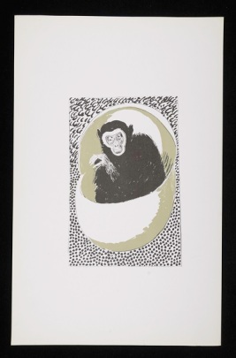
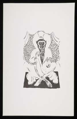
(top) CHA-P-1602, Duncan Grant, colour proof, This Egg Changed into a Stone Monkey, ink on paper. Photograph © The Charleston Trust (bottom) CHA-P-1619, Duncan Grant, colour proof, Monkey… I hereby promote you to be the Buddha Victorious in Strife, ink on paper. Photograph © The Charleston Trust

Now we have moved onto cataloguing larger works we are uncovering many intriguing and beautiful works but what especially caught our eye this week was a collection of original lithographs and colour proofs by Duncan Grant. Up in the Charleston Attic we are used to playing detective and after some research we learnt that this collection of forty pieces are a result of a commission in 1965 by The Folio Society to produce illustrations for its publication of Arthur Waley’s translation of Monkey: a folk-tale of China, more commonly known simply as Monkey. The translation is an abridged version of the 16th century Chinese novel Journey to the West by We Cheng of the Ming dynasty.

Monkey is widely considered to be one of the four great classical novels in Chinese literature and is based on the true story of a pilgrim named Hsuan Tsang. In the seventh century Hsuan Tsang travelled to India to procure the true Buddhist Holy Books to translate into Chinese, making a great contribution to the development of Buddhism in China. By the tenth century the pilgrimage of Hsuan Tsang had become the subject of fantasy and folk-lore and from the thirteenth century till the present day the story has been constantly presented and re-imagined on the Chinese stage.

The novel takes the tale of Hsuan Tsang and presents it as a combination of folk-lore, allegory, religion, history, anti-bureaucratic satire and pure poetry. At the outset of the novel Buddha seeks a pilgrim who will travel West to India with the hope of retrieving sacred scriptures by which the Chinese people may be enlightened. A young monk called Tripitaka volunteers to undertake the pilgrimage and on his journey he encounters the Monkey King and two monsters in human form named Sandy and Pigsy. The theme of the novel is mans journeying through the difficulties of life with Monkey representing the instability of genius, Pigsy symbolising physical appetite and brute strength while Sandy embodies sincerity. Hatched from a stone egg and given all the secrets of heaven and earth Monkey can transform himself into seventy-two image such as a tree, a beast of prey or an insect and can ride on clouds, travelling 108,000 miles in a single somersault.

Grant produced twelve lithographs for the 1965 publication, with examples of eight of these works in various stages of completion being found in the Angelica Garnett Gift so far. Previously he had been commissioned to design the jacket for the 1942 edition of Monkey. In the cover design he wound the image of the Monkey King around the entire book and at the suggestion of the publisher David Unwin the title details of the book were put at the back, so as to be in keeping with the reverse nature of Chinese literature. The pieces found in the Gift show the various stages of colour proofing Grant would have completed before he was happy with the final image. We see the same image being produced repeatedly with different colours added or taken away. It appears that Grant worked to apply a deliberately Chinese style for some of these works. We know that there were established links between China and the Bloomsbury group. Julian Bell, Vanessa’s son, lived and worked in China, sending Chinese silks, porcelains and ceramics to his mother at Charleston and Roger Fry delivered Slade Lectures on Chinese Art at Cambridge. Some of these ceramics and other objects of Chinese origin remain on display at Charleston today, for example the cast of a sixth century AD Chinese Bihisattva Kuan-Yin, Goddess of Mercy which was given to Grant and Bell by Fry is in the artists former studio.

CHA-P-1609-R_CCHA-P-1606-R_CCHA-P-1605-R_CCHA-P-1760-A_C

(top) CHA-P-1609, Duncan Grant, colour proof, Wild and fearful creatures, ink on paper. Photograph © The Charleston Trust (second down) CHA-P-1606, Duncan Grant, colour proof, Wild and fearful creatures, ink on paper. Photograph © The Charleston Trust (third down) CHA-P-1605, Duncan Grant, colour proof, Wild and fearful creatures, ink on paper. Photograph © The Charleston Trust (bottom) CHA-P-1760, Duncan Grant, colour proof, Dust-jacket for Monkey 1942, ink on paper. Photograph © The Charleston Trust

Grant’s and also Vanessa Bell’s enthusiasm for lithography was encouraged by French artist, and friend to the Bloomsbury artists, Pierre Clairin. Professor of Lithography at the Ecole des Beaux-Arts, Clairin was often Grant and Bell’s host in Paris and had much experience of the procedure of lithography. Examples of his small and delicate colour lithographs can be seen on the walls of Charleston to this day.

Having gained knowledge of lithography in Paris it was closer to home where Grant would find a patron, or patrons, to allow him to develop his interest in producing prints and lithograph illustrations. The Ladies of Miller’s, sisters Frances Byng-Stamper and Caroline Lucas, opened a gallery on the High Street in Lewes in 1941. With a passion for art, literature and music and the support of Maynard Keynes, the chairman for the Council for the Encouragement of Music and the Arts (CEMA), the sisters secured the pick of touring exhibitions and presented shows with sculpture by Rodin, Maillol and Epstein and paintings by Bonnard, Picasso and Derain. Clive Bell was heard to joke that ‘Lewes had become one of the cultural capitals of Europe’ as the sisters began publishing books, instigating lectures, concerts, began a shortly lived art school at which Grant and Bell were teachers and organised a retrospective of the Omega Workshops.

At the end of the war in 1945 the sisters were to receive an exhibition by CEMA of European lithography from 1792 to the present day. To this they added their first publication of a portfolio which contained two lithographs each by one of the Ladies of Miller’s herself, Caroline Lucas, Vanessa Bell, South-African born painter Ensin du Plessis and Duncan Grant. This first publication was an resounding success with the public responding avidly and the one hundred copies of Eight Lithographs which was priced at five pounds being sold within weeks. This positive public reaction led to the Ladies of Miller’s joining forces with the Redfern Gallery in London in 1948 to form the Society of London Painter-Printers. The gallery at that time was under the direction of Rex Nan Kivell and was considered to be the principal outlet for contemporary prints. That year, Six Lithographs by Grant and Bell was published. The lithographs they produced for this work had an undeniable charm, their anecdotal subject matter appealing to the masses with portraits of their grandchildren, still lives of flowers and fruit and images of domestic animals. The working relationship between Grant, Bell and the Ladies of Miller’s continued until the Press was disbanded in 1954. Although Grant accepted occasional invitations to produce lithographs and etchings following Bell’s death in 1961 the most productive years of their collaboration concluded with the dissolving of the Press.

CHA-P-1603-R_C CHA-P-1594-R_C CHA-P-1622-R_C CHA-P-1608-R_C

(top) CHA-P-1603, Duncan Grant, colour proof, She threw down her ball, and it fell exactly on the middle of Ch’ens black gauze hat, ink on paper. Photograph © The Charleston Trust (second down) CHA-P-1594, Duncan Grant, colour proof, Bodhisattva, ink on paper. Photograph © The Charleston Trust (third down) CHA-P-1622, Duncan Grant, colour proof, Monkey forgot all about the Star Spirit and soon left him far behind, ink on paper. Photograph © The Charleston Trust (bottom) CHA-P-1608, Duncan Grant, colour proof, Death of the dragon, ink on paper. Photograph © The Charleston Trust

Much has been written about the art and private lives of the Bloomsbury artists yet little attention has of yet been paid to their graphic work. Although it forms only a fraction of their artistic oeuvre, Grant’s Monkey illustrations demonstrate clearly his ability to produce light-hearted, delicate and engaging lithographs. Grant, echoing Roger Fry’s desire to dismantle the barriers between high and applied art, would accept any printing commission that was offered to him, although of course payment for artwork would surely have also been a motivating factor to print. Arthur Waley’s translation of Monkey remains one of the most read English language versions of the novel and one can imagine that Grant’s illustrations have provided delight and entertainment to many throughout the years and hopefully will continue to in years to come.