The Charleston Attic

Category: Design

An Unexpected Frieze

A beautiful frieze was re-discovered today! Under a magnifying lens we identified that the frieze was hand painted with a chalk based paint, applied onto plaster. Dating from around 1800, it is possible that a technique called fresco was used, which means the artist painted directly onto wet plaster. The frieze could have been used for a number of different decorative purposes: a mural, the edging of a frame or it could have been applied directly onto the wall. The frieze was not created by one of our Bloomsbury heroes however it was evidently a source of inspiration given that it has been carefully wrapped in brown paper.

Frieze

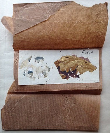
CHA/P/3766, wallcovering frieze stuck onto squared paper wrapped in brown parcel paper with hand written annotation ‘Frise’, chalk based paint on plaster, c. 1800.
Photograph
© The Charleston Trust.

Unfortunately only one of the two frieze examples survives. With only a small amount of debris left, the first almost non-existent frieze is decorated with shades of duck egg green. Much more intact, the other frieze is of an acanthus leaf which is painted in shades of brown with a delicate gold finish.

The frieze was in the middle of a sketchbook with ‘SENS’ written on the cover. It is likely that the sketchbook belonged to Duncan Grant as the book bears his name on the back page. As well as this, letters and postcards stored in the Tate’s Archive were sent from Sens, France by Grant to Vanessa Bell in December
1924.[1]

Front [22 December 1924] by Duncan Grant 1885-1978
Postcard written by Duncan Grant to Vanessa Bell sent from Sens, 24 December 1924. Photograph © Tate Archives.

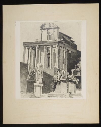
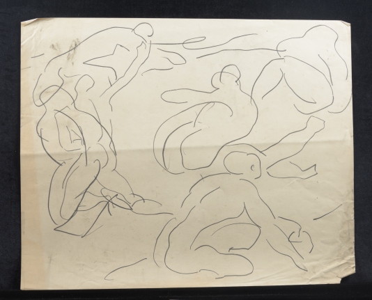
The paper ephemera contains Grant’s excitement after visiting Sens and Dijon Cathedrals, explaining how they make ‘a lovely drawing’.[2] Several pages in the sketchbook are of murals and biblical scenes that have probably been inspired by these Cathedrals.

Inspired by Cath.jpg

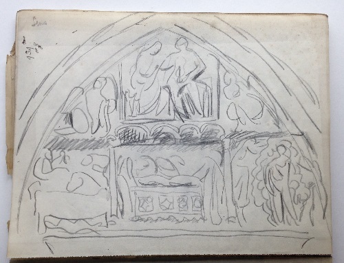
CHA/P/3766, biblical scene with hand written annotation ‘Sens’, pencil on paper, c. 1924. Photograph © The Charleston Trust.

On one of Grant’s many trips to France, this frieze has probably been removed from a building of some significance given the fine workmanship of the object. Could the frieze have come from one of these magnificent buildings Grant visited on his travels? There are many mysteries that surround this frieze, but what an excellent thing to re-discover in the middle of a sketchbook.


[1] In two letters to Vanessa Bell, Duncan Grant speaks of his fondness of the cathedrals. Letters can be found at the Tate Archive: www.tate.org.uk/art/archive/tga-8010-5-1338/, www.tate.org.uk/art/archive/tga-8010-5-1337/

[2] Tate Archive, Postcard from Duncan Grant to Vanessa Bell, 24 December 1924, Online access: www.tate.org.uk/art/archive/tga-8010-5-1339

Duncan Grant and Henri Matisse

In August, the curatorial team began cataloguing the larger works on paper and canvas of the Angelica Garnett Gift. The discovery of a dynamic pencil drawing depicting four frantically moving figures encircling a fifth immediately bring Matisse’s famous work Dance to mind.

The rough sketch is undated and unsigned, and like so many of the quick ephemeral drawings by Grant in the Gift, it is in perfect condition. Was this sketch a design for a larger, more detailed work on canvas, perhaps? Had Grant directly been inspired by Matisse’s Dance?

cha-p-3004-r_c

CHA/P/3004 Recto. Artist Unknown (Likely to be by Duncan Grant), study of moving figures in a circle, pencil on paper. Photograph © The Charleston Trust.


We have found several items in the archives that indicate an interest on the part of Bloomsbury in Matisse and his career. There are two records of Matisse exhibitions; one, a card for ‘The Exhibition of Contemporary French Painting’ (undated), and the other, a poster advertising a show at the Musee Matisse in 1955. We also found a commercial print of the work ‘Nu Bleu’, bought by Duncan Grant in 1968 after visiting the ‘Matisse 1869-1954’ Retrospective Exhibition at the Hayward Gallery by the Arts Council.

cha-e-222-r

CHA/E/222 Recto. Exhibition advertisement card, for Henri Matisse exhibition, date and place of exhibition unknown. Card © The Estate of Duncan Grant. . Photograph © The Charleston Trust.

edited-matisse-nu-bleu

CHA/P/83 Recto. Print,  of Henri Matisse’s work ‘Nu Bleu’, purchased by Duncan Grant in 1968. Print © The Estate of Duncan Grant. . Photograph © The Charleston Trust.

Matisse 'Nice'.jpg

CHA/P/317  Recto. Poster, for Henri Matisse exhibition in Nice, France, in 1955. Poster © The Estate of Duncan Grant. Photograph © The Charleston Trust.

Nasturtiums, or Nasturtiums with the Painting ‘Dance’ I, as it was later named, features a memorable motif from the most well-known early modernist work by Matisse, ‘Dance’. In both works, the nude figures depicted form a circle, linked by their hands’ their bodies bowed in the joyful movement of dance. The scene is a celebratory one: the figures have shed their clothes with gay abandon, and are embracing all that is natural within and around themselves.

‘Here was a possible path,’ wrote Vanessa Bell of the first Post-Impressionist exhibition in 1910 in which Matisse’s work featured. ‘A sudden liberation and encouragement to feel for oneself, which were absolutely overwhelming.’[1] The desire to paint, then, matches the desire of Matisse’s nude figures to dance.

Grant, The Dancers, 1911.jpg

Duncan Grant, ‘Dancers’, 1910, oil paint on canvas. Photograph © Tate.

Looking at Duncan Grant’s 1910 work Dancers , one can see straight away how Grant had been inspired by the bright colours, and the bold and dynamic figures caught in flowing movement that Matisse depicted in his Dance series. ‘It is as if Duncan had suddenly learnt to diminish the emphasis on materiality, on textures, light and shade, in order to allow for a more vibrant use of line, interval, structure and movement,’ writes Frances Spalding of Grant’s work. ‘Matisse helped liberate him from the tyranny of appearances.’

[1]Frances Spalding, Vanessa Bell, p.101


PS. It may be of interest to regular readers that we will shortly be bidding a sad farewell to the Charleston Attic. What a rewarding 6 months working as Curatorial Interns it has been- from the fascinating discoveries we have made to the in-depth research carried out, not forgetting our involvement with the Festival.

We would like to welcome our new Intern, Dr. Anne Stutchbury, to the Attic, and wish her the best of luck with her work.

A big thank you to our followers- your readership has been greatly appreciated! Keep following The Charleston Attic Blog for new and exciting archival discoveries and research insights…


Philippa Bougeard and Emily Hill

Europa and the Bull in ‘The Arts’


The Arts 16.jpg

Duncan Grant, illustration for ‘Europa and the Bull’ poem by W Rodgers, ‘The Arts’ journal, 1946.

This week in the Gift, we look at a series of objects that reveal a more commercial side to Duncan Grant’s work. In 1946 a commission by ‘The Arts’ a modern art journal, under the editorial supervision of Herbert Read, Edward Sackville-West, and Desmond Shawe-Taylor, provided a public platform for a new artistic collaboration. Grant’s contribution to the magazine was a painting and illustrated poem of ‘Europa and the Bull’ by W. R. Rodgers.

The Arts 17

‘The Arts’ Issues One and Two, Lund Humphries & Co Ltd; London.

‘The Arts’ was interdisciplinary in nature, covering a range of artistic forms and practices within each issue. The first two issues feature in detail painting, sculpture, architecture, theatre, film, music, poetry and philosophy. The journals were designed to be aesthetically stimulating, presenting cover work and illustrative interpretations of poems and prose by contemporary artists alongside high quality colour lithograph plate representations of more prominent works.

The utilization of a variety of paper and print techniques emphasize the depth and detail in the featured images; the subsequent quality of the images were evidently realized by the editorial board. Content was also held in high regard as the journal features many esteemed writers such as Clive Bell (this was most likely the connection that secured Grant his commission), Edward Sackville-West, Robert Medley, Sir Kenneth Clark, Benedict Nicolson and Raymond Mortimer amongst others. At ten shillings a book the high quality was quite matched by the price, and readership would have most probably been limited to the educated middle classes. With only two issues published, Issue One in 1946 and Two in 1947, information regarding the journal is unfortunately limited.

CHA-P-2705-R_c

 CHA/P/2705 Recto. Duncan Grant, design for ‘Europa and the Bull’ poem by W Rodgers, pen on paper. Photograph © The Charleston Trust

Duncan Grant’s works in the gift includes studies for the illustrated poem as well as the final piece used. Gaining inspiration from ‘Europa and the Bull’, Grant’s form emulates classical mythology as well as the natural world. The cross-hatching of black penned lines against the text blurs the poem into the piece, mirroring the imperfect lines of language. Impressionistic in line, the inscribed pen strokes add texture and tone to the image.

The Arts 13

‘The Arts’ Issue One, Lund Humphries & Co Ltd; London.

The opening page of the poem and thus Grants illustrated segment (this original was not found in the AG gift), is strikingly juxtaposed with a large photograph. An abstracted female form seated pronounces a smooth modernist sculpture by Henry Moore, which sits opposite the contrasting classical design. A black pen illustration envelopes the poems text, showing seated female nudes frolicking in the textured grass. This work somewhat mirrors the panels Grant produced for the Cunnard Commission, a design for interior decorative panels to be exhibited on RMS Queen Mary (although these were later rejected).

The Arts 14

‘The Arts’ Issue One, Lund Humphries & Co Ltd; London.

 The feature comes to a close with a lucid and bright painting by Grant. A matte paper displays the colours in block form and in an array of fresh pastels we are finally introduced to Europa. She lays nude on the back of the Bull, one arm above her head gesturing playfully with a red scarf, the bull moves steadily through the water, expressive of a unity between them.

Two images within the gift show studies for this final print, evidencing differing concepts for the composition of the piece. Grants inspiration from the myth of Europa is clear; where Zeus captures her in the form of white bull and their sexual relationship legitimises Europa’s powerful son, King Minos of Crete.

CHA/P/2626 & CHA/P/2627 Recto. Duncan Grant, designs for ‘Europa and the Bull’ poem by W Rodgers, pencil on paper. Photograph © The Charleston Trust

The piece below is a design that did not make the final print, though it could have been inspiration for the final image used as the same colour palette is evident.

CHA/P/2704 Recto & Verso. Duncan Grant, design for ‘Europa and the Bull’ poem by W Rodgers, inscription “Design for ‘Europa and the Bull’ poem by W Rogers, (sic) c1945”, pencil and gouache on paper. Photograph © The Charleston Trust

This set of images were not Grants only work produced for the journal; also linked is a study for a front cover of ‘the Arts’ in his usual bold style full of form and movement. Figures appear to be dancing across the pages, acrobatics with circular instruments create motifs repeated throughout the piece displayed in the curves of the male physique and reflected in the text form. We do not know if this was an early study for one of the initial two journals or a suggestion for the next, nevertheless production for ‘the Arts’ was unfortunately discontinued in 1948.

.jpCha-p-1803-rg

CHA/P/1803 Recto. Duncan Grant, cover design of ‘The Arts’ journal, never produced, watercolour on paper. Photograph © The Charleston Trust


On Vanessa Bell’s Birthday: 30th May 1879

Vanessa Bell née Stephen was born on this day in 1879. A key member in the creation of the Bloomsbury aesthetic, Vanessa was a prolific worker and over the course of her life produced vast quantities of paintings, drawings, interior design and furniture decorations, woodcuts, book covers, textile and crockery designs. There is a large portion of her work in the AG Gift, spanning from her earliest days at Charleston to her death in 1961.

 CHA-P-606-1_cVB
CHA/P/606 Vanessa Bell. Sketchbook. Photograph © The Charleston Trust.

Today, on the day of Vanessa Bells birthday, we are sharing works found in Charleston archives, that celebrate the legacy she left here.


0 T UMAX     PowerLook III    V1.5 [2]

CHA/P/174 Recto. Vanessa Bell, The Kitchen,  c.1943,  painting.  Photograph © The Charleston Trust.

Painted from inside Charleston this image shows a young Grace Higgins, Charleston’s housekeeper (1920-70), in the kitchen  preparing a meal. A basket of fresh vegetables from the garden lay in the foreground these would have been an important part of supplementing rations during wartime. With the help of Grace, Vanessa ran an orderly and welcoming household and Grace’ work meant that Vanessa could paint full time.

CHA-P-2501-R2_CVBPost

 CHA/P/2501 Recto. Vanessa Bell, print of classical scene in Rome, ink on paper. Photograph © The Charleston Trust.

Vanessa’s travels are well documented in the gift and she explored France, Italy and England often in the summertime. Painted during a trip to Rome this image shows a picturesque scene of a church with sculptures that stand on plinths in front of its facade. Vanessa was inspired by both the classical architecture and art of these destinations. Many classical figures and studies are featured within sketchbooks in the gift.


DEC-3aVB

CHA/DEC/3 Vanessa Bell, Fireplace early 19th Century, painted 1925-30, marble. Photograph © The Charleston Trust

This colourful and modern fireplace painted between 1925 and 1930 shows Vanessa’s skill in abstracted domestic design. Proudly displaying her cross hatching and circular motif this playful piece is perhaps a quinessential example of Bloomsbury design aesthetic. Situated in Clive Bell’s study this is one of the first objects visitors view when visiting Charleston today.

Angelica Garnett: A Legacy at Charleston

Of the last descendant of Bloomsbury’s ‘inner-circle’, an impressive obituary of 4th May 2012 remarks that Angelica’s parentage gave her a ‘double share of Bloomsbury inheritance.’  The only child of Vanessa Bell and Duncan Grant, Angelica Vanessa Garnett was a talented woman. Undoubtedly affected by her parents’ artistic talents and her unconventional upbringing at Charleston, Angelica’s vast resume encompassed writer, painter, performer, ceramicist and sculptor.

CHA-P-1643-R_C ag

CHA/P/1643 Angelica Garnett. Two children sat at table. Painting. Photograph © The Charleston Trust.

Born at Charleston on Christmas Day of 1918 Angelica’s arrival marked the end of the war as well as the end of her parent’s sexual relationship; however, her birth tied them together in a significant way, perhaps a reason for living and working together for the remainder of their lives.

Angelica grew up being doted on by her mother, though her paternal relationships were a little more complicated; growing up believing that her father, like her brothers, was Clive Bell. Angelica was informed of her true parentage at the age of 18, upon sternly being advised not to mention the subject again. Where Vanessa perhaps believed that her child had the love of two fathers, Angelica wrote that ‘in reality,’ she ‘had none’. Her widely acclaimed memoir of this period Deceived with Kindness, the experience of growing up at the centre of the Bloomsbury Group, is considered an important part of the set’s social literature.

CHA-P-1642-R_C ag

CHA/P/1642 Angelica Garnett. Woodland animals by stream. Watercolour and Pencil on Paper. Photograph © The Charleston Trust.

Angelica’s legacy does not end with literature. Many of her early art works (often produced in collaboration with Vanessa) can still be viewed at Charleston, a special example displayed in the spare bedroom. Her sketchbooks also form part of Charleston’s archive, containing fashion design, pattern design and still lives. Recognising and promoting Charleston as a place of significant artistic heritage, Angelica and her brother Quentin’s gift of the house to the Trust along with their tireless work during its period of restoration in the 1980s was instrumental in securing a future for Charleston post-Bloomsbury.

CHA-P-2437-21ag

 CHA/P/2437 /21 Angelica Garnett. Waistcoat design. Pencil on Paper. Photograph © The Charleston Trust.

Aside from the estate, perhaps Angelica’s biggest legacy is the Angelica Garnett Gift, a collection of over 8000 works on paper and canvas. The pieces, mainly works by her parents, had previously filled the drawers, cupboards and studios at Charleston. After Duncan Grant’s death they were held in London at an art storage facility and were largely unseen for nearly 30 years. In 2008 these works were gifted to The Trust, and the exciting work of discovery began. Previously unpublished, this inspiring collection teaches us about the artistic practices and evolution of two internationally acclaimed artists.

CHA-P-2437-5ag

CHA/P/2437/5 Angelica Garnett. Domestic pattern, red and blue crown with green leaves. Photograph © The Charleston Trust.

The Gift continues to encourage new insights into Bloomsbury’s creative processes and engages us (the attic interns) in the museum documentation processes of cataloguing, digitalizing, conservation and research. Angelica’s gift to Charleston was generous and significant; with it she leaves an important legacy, one that celebrates her family, their work and more intimately, their lives.

CHA-P-2436-17_c ag

CHA/P/2436/17 Angelica Garnett. Moored boats by trees and houses. Watercolour on Paper. Photograph © The Charleston Trust.


Omega Textiles: Artistic Production for Domestic Design

An inscription featured on the verso of this object allows us a glimpse into what its image might conceal. The address of Omega Workshops Ltd. ‘33 Fitzroy Square’ is inscribed on the paper. This firm, which was directors’ Roger Fry, Duncan Grant and Vanessa Bells’ first experiment in commercial domestic design, was in a way a patronage of their recognisably bold modernist design aesthetic.

With roots in many aspects of the Arts and Crafts movement, which developed at the end of the 19th century, Omega, established in 1913, sought to remove perceived divisions between the decorative and fine arts. Designing and producing furniture, textiles, painted murals and household goods; the Omega Workshops became a method through which Fry could employ and encourage artistic work from many of his friends and acquaintances. The aesthetic of Omega was largely Post-Impressionist, however numerous other influences become apparent when studying the breadth of work produced in their short period of trading.

CHA-P-2622-R_c blog

CHA/P/2622.  Omega pattern design. Gouache on graph paper. Recto. Photograph © The Charleston Trust.

Standing alone, as a piece of art usually must, the design is modern, geometric and angular in composition. Its circles, arranged in context like cogs revolving in a mechanical engine seem an influence at odds with the arts and crafts ethos, one of Vorticist and Cubo-Futurist movements of the period. These sought to capture speed and energy with an interest in the mechanics and dynamics of the modern age.

A couple of words scattered on the back of the piece craft a complex history of its authorship; these read ‘Not by VB. Fry?’. Inscribed in pencil as lightly as the comment is unsure of itself, they are markings of a number of possible viewers. We know Grant signed many works retrospectively in the 1960s (sometimes even signing the work of others, often attributing work to ‘VB’), both for exhibition and sale. Previous to the Angelica Garnett collection being gifted to Charleston, others would have had access to the works so this inscription could have been penned by a viewer after Grant’s death. The letters on the recto of the image (written contemporaneously) seem to spell ‘soiree’ which could be the authors title for the piece, and below a three letter initial which matches none of the known members’ signatures. According to the inscriptions on the verso, the latter authority must have agreed, and attributes the image (uncertainly) to Roger Fry.

CHA-P-2622-V_c back

CHA/P/2622. Blank page with inscriptions; ‘Not by VB. Fry?’ and ’33 Fitzroy Square’. Verso. Photograph © The Charleston Trust.

The design is painted in gouache on graph paper; the squared canvas allowing for precise straight lines and calculated geometric pattern. Additionally, this material could have been used to accommodate a better translation into a rug, cushion or textile design. Omega artists produced patterns and these unusual designs had to be translated, often creatively, by manufacturers. Omega rug designs were thought to be manufactured by English firm ‘The Royal Wilton Carpet Factory’ who opened a London office in 1913. To ensure products were bought for their aesthetic appeal and quality, and not for the reputation of the artist or designer, works were not signed individually. Works were marked only by the letter ‘Ω’. This could be why the design appears not to be signed by any known Omega textile artist.

It is possible that this piece was created by Frederick Etchells, painter and founding member of the Omega workshops, following that many of his works on canvas were highly geometrical in style. In 1913, during production of works for Omega, Etchells worked closely and in collaboration with Duncan Grant in Grant’s London studio. Etchells decision to leave the guild at the end of that year was followed by his joining Wyndham Lewis’ Vorticists, a group that were in opposition to Omega. Though Etchells soon gave up painting and became a successful architect, this preliminary work certainly shows a sense of the architectural, featuring blocks built on top of one another with relief-like circular and square forms structured into the image.

Although the written signature is missing here; the signing ultimately is in the work, where paint and painter combine to produce a corporeal object and image standing in for the body and then name of the painter. We can only speculate as to who the author is but this preliminary design for a textile shows a vision for domestic design that remains modern 100 years after its production.